A few more sketches. It was hard to motivate myself to get much sketching done today because it was so hot! I wanted nothing more than to stretch out on the couch with the fan next to me and a tall glass of icy water, and maybe snooze a bit. But I'm trying to keep myself to an early schedule for the next couple days because I leave for Gencon on Wednesday morning, in Indianapolis, and I'll have to be getting onto that earlier time zone. Might as well stick with the hours I've been doing lately and make things easier for myself.
Going to try and get all 12 sketched out before I start painting. Partially because for now I'm still awaiting feedback from the art director, so I can't really proceed anyway. But also because the deadline for the cover piece comes first, before all the interiors! Marketing department needs a cover to start advertising as soon as possible. This makes things a bit tricky for me since it means I have to figure out the gist of all 12 paintings within the next two months so that it can be incorporated into the cover.
Dreamscapes 2 had a similar situation, where the cover was required far in advance of the interior material. That was easier to deal with however because the cover didn't necessarily have to reflect the interior pieces, just to encompass the general theme.
* * *
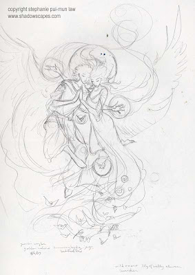
1st sketch. Toyed with it a bit. Might use it someday for something else, but it wasn't really calling to me for this.

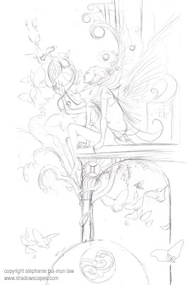
2nd sketch. Liking this one much better. Hopefully the art director does too.

Had to modify the format of the image a bit too from the sketches I did the previous few days, as my contact initially forgot to mention that the pieces didn't take up the full page area. The right margin of the 12x12 inch calendar is needed for all the astrological information.

They are both lovely - the second reminds me of a Michael Parkes' composition but more graceful !
ReplyDeleteI love the second one, such beautiful motion.
ReplyDeleteI like the first Gemini sketch. There's more movement in it. I also like the concept of the twins being brother and sister; that's different than what I typically see (2 sisters).
ReplyDeleteI really like the 2nd one ... like they are sitting on the front step of their astrological house :)
ReplyDeleteHi, Stephaine! I'm from Brasil and I'm your big fan in deviantart and only now discovered you blog. It's amazing, congratulations for this!
ReplyDeleteI love track the work in progress and its "history" and creative process.
You are the biggest!