* * *
Note: This isn't meant to be a tutorial so much as a walk-through of my process. When writing instructional tutorials I try to be a bit more purposeful and conscious of choices made. Though in truth my process is usually much more chaotic and consists of decisions made on the fly. Chaos doesn't generally make for very good instruction though, so while I try to define a process in Dreamscapes that is logical and easy to follow, I think simultaneously that "simplification" raises an illusion about creating art that makes things more daunting in a way.
I wanted to show here that it is not always so thought out. Every choice about color and composition doesn't have to be made before you start (though with watercolors, you do have to have at least a general idea in mind). And that accidents and decisions made on the fly are a part of the whole process. A part of the fun of creating art in fact.
* * *
10x15 inches
Strathmore lightweight illustration board
Winsor & Newton pan watercolors: Burnt Umber, Payne's Gray, Reddish Brown, Lemon Yellow
a few Kremer Pigments: Elderflower Purple, Stinging Nettle Yellow
 Step 1
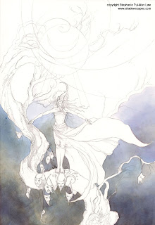
Laying in the Background
I start off with the lower background, working from the ground up.
Courtesy of my friend Sophie Klesen, I have in my posession some lovely paints from Kremer Pigments Inc. Their colors are historical pigments, and have a fascinating way of separating and creating unexpected variations of tone, especially when some kind of texturing is applied to the wet paint.
At any rate, I've fallen in love with this Elderflower Purple. I've been looking for an excuse to use a lot of it.
I painted the the lower area in with many thin glazes, alternating the purple with some mixes of Burnt Umber and Payne's Grey as well. At one point I realized that the purple lifted exceedingly easy. And I know that Burnt Umber and Payne's Grey are generally more permanent. So as I started on the left lower corner, I painted the lower layers with the greys and browns and reserved the upper layers for the Elderflower Purple, and I found this made creating a smooth background much easier.
Determining the ordering of layering is something that you figure out as you experiment and actually work with colors, as every pigment has its own qualities and lifts easier or harder or behaves differently when splattered with salt or rubbing alcohol.
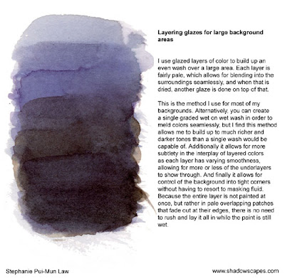
 Step 2
Background Skies
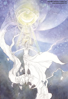
Moving upwards, continuing the slow layered glazes up into the sky. Now though I'm splattering it as I go with rubbing alcohol to create a starry texture.
I'm using a no 10 round brush for most of this, blending out small patches as I go so that it creates a seamless background. You can notice there's color shifts in the upper sky of what seems like blue and purple varations. Here's one of the things I love about these Kremer pigments -- that's all from the one Elderflower Purple color. It just...varies by itself.
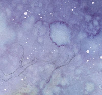 And if you look closely at the rubbing alcohol splatters, it looks more like Cerulean Blue in the center, with Magenta outlines. Pretty neat stuff. :) Can't wait for Sophie to send me more colors from Germany at the end of May.
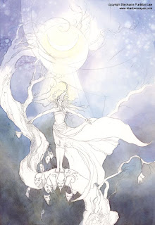
Anyway, lots of splattering and glazing, and a Lemon Yellow nimbus around the moon, and her head, blending into the white surrounds with water and dabbing with paper towels.
 Step 3
Moonbeams
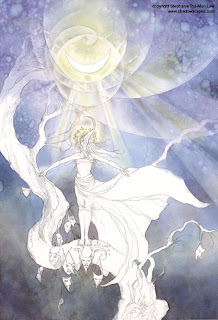
I keep darkening the background with more glazes. This kinda just keeps going until it feels done. Watercolors dry pretty fast, though not instantly. So sometimes after working in a wash say in the upper corner, I'll want to continue layering there but it's currently wet. So I'll switch to another layer at the lower corners instead and then switch back to the top after it has had a chance to dry. I jump all over a painting like this, working wherever is currently convenient. There's no need to stay locked to one element of the piece at a time.
Now for some more Kremer fun, I pull out the Stinging Nettle yellow, which sometimes surprises me with little bits of crimson in unexpected places. But I use that to fill in the moonbeams, blending it softly into surroundings. Leaving the moon itself with the white of the paper.
 Step 4
Need More Moonbeams!
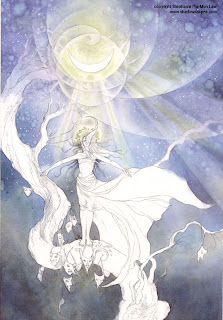
At this point, I sat back and decided that I didn't like the symmetrical moonbeams just on her outstretched hands. The background was looking too BoringBlue. Considered for a while, then decided to add more moonbeams off to the right side. Sketched in very faint guidelines in pencil, then proceeded to paint those in with more Elderflower Purple and Stinging Nettle.
 Step 5
Stars and Shadows
Trusty white gel pen, dotted in the stars. I'm not really a stickler for purist watercoloring. If it works, do it.
Also, shadowy tendrils of hair on her with various mixtures of Payne's Grey, Burnt Umber, and Elderflower Purple.
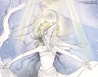
So here's my stopping point for today. Some book layouts are calling to me so for the moment Moonbathing has to be set on the back burner. More will be forthcoming over the next few days!

Thanks for this tutorial :)
ReplyDeleteI would ask you if it's possible to use another way for the sky effects, that isn't alcohol.
Thanks again!
*peeks at that manufacturer's website* Oh no, they don't have the colors you're talking about listed...! I wonder if they only sell them in brick and mortar stores? That's too bad, because those colors you're using are gorgeous. :)
ReplyDeleteYes, unfortunately they don't sell to everyone, this is their statement on their Online Store:
Delete"Kremer Pigments supplies pigments and binders to professional users. We do not sell to minors."
It makes us feel really unimportant, such a shame, their products seem amaing.
Hm, I'm not sure, as I've actually never done the ordering myself. My friend is picking them up from the actual store in Germany, and those were the names she told me but perhaps she was talking about what went into the pigments rather than their actual names. I can check with her and get back to you if you're interested.
ReplyDeleteThanks for sharing the stages of your artwork...i always enjoy watching the process of other artists, i always learn something new!
ReplyDeleteThe colors are beautiful, and i love the little addition of the white gel pen in the sky...very nice. What kind/brand of gel pen is it? I look forward to seeing the rest of the stages...thanks again!
I'm using a Sakura Gelly Roll (Sounds yummy)
ReplyDeleteWow, what a color! Id also be interested in this purple - finding that perfect purple is definitely a challenge! <3
ReplyDeleteI love how you glaze backgrounds I need to stop rushing through them and spend more time on them!
When I was young I used sakura chinese watercolors and I still have a painting From when I was seventeen the colours are still Georgeous as they were the day I painted them!
ReplyDeletealso another tip you know those little bottles that has eye glass cleaner in them they have a really fine mist action for weting areas of your painting and there controlable because there so small you can do fines areas with out messing up the rest of your painting! good if your doing a portrait and don't want it to dry before you get the skintones laid in. allows you to work without rushing and you can put you most transparent colours in them for fading washes or adding a little more colour to your sky or water areas but you probably already know that! :Flash-13: from dA
Hmm I like you as much as #7 did in the movie!
ReplyDeleteStephanie! Beautiful! or was he #5 maybe #5 I think instead! # 5 alive I can't remember the name of the movie though! I'm getting old! I guess.
ehm, any answer? i asked something in the first comment. Again, compliments for all your works.
ReplyDeletesorry for bad english.
Wait, I think I misread. Are you mixing the pigment with a binder yourself? I might be looking on the wrong part of the website (the ready-made paint) instead of the part with the powdered pigments. :)
ReplyDeleteMichael - haha, it was #5. 'Number five ALIVE!!!'
ReplyDeleteRah - Sorry forgot to answer the first time! What effect do you mean in particular? Are you talking about the speckled lifting? No effect can really be completely duplicated by anything else. It's all got a slightly unique way of effecting the paint, so probably not.
haikujaguar - Nope I'm using the powdered pigments. You can actually just mix it with water.
No kidding! *boggle* *goes to check website again* :)
ReplyDeleteThanks for posting these details with your descriptions! I enjoyed reading them so much I'll probably link them from my blog on Monday. It's always great to see an artist do walk-throughs like this!
oh, well... so, i need just this rubbing alcohol if i want try to do this textre.
ReplyDeleteThanks ^^
rubbing alcohol is cheap...it's sold at drugstores for $1 for a big bottle. It's probably the cheapest material used aside from paper towels. Hehe.
ReplyDeleteThis comment has been removed by the author.
DeleteWell, after several years trying and being told by pharmacists and alike that it doesn't exist, I finally found a product which is sold as an antiseptic cleaning product, but although the name is different, it actually is rubbing alcohol, can't believe it!
DeleteLooking forward to try your method Stephanie!
Steph, we really should consider sending a jpg of your works to KRemer, you know... maybe they'd have gift samples for us ;)
ReplyDelete"Please give me free stuff!" hehe. I mean sheesh, look at all the free advertising I'm doing for them here right now.
ReplyDeleteFor those who were interested in knowing what the purple was, here's the exact link:
ReplyDelete36308 Elder
http://www.kremerpigments.com/shopus/index.php?cat=01040302&lang=ENG&product=36308
Can also see it if you scroll down this page and search for 36308: http://kremerpigments.com/naturfarben-us.html#Apfel
Thank you so much for posting the steps of your work. It is very nice to watch and they can be very helpful, even for people just starting out.
ReplyDeleteI do have a question though: I love the circles around the moon (it is an affect you use frequently in your paintings as I noticed), but I can't exactly tell if you are lifting the color, or just building up color around them? Also - if you lift the color, do you do that with alcohol, or is that only used for splatters?
Hope you can answer this. Thank you again for these beautiful posts.
Alexiel -- I do it by just painting around it. This is where the planning aspect of watercolor comes in. You just have to know which areas you want to leave light and be careful not to paint too darkly over them.
ReplyDeleteStephanie, thanks for sharing with us this process, your work inspires me a lot! Lalys
ReplyDeleteI just say your book when I was paying for my items at craft store. Immediate caught my eyes. I love your work is so inspiring. Sure do get my imagination flowing for my sculpturing artwork. Is like a muse. I love the way you interpretation is. Beautiful portrayed. I pray God to always bless you and give health for us to be able to enjoy all your wonderful work for a very long time to come. Now I can wait to get the other books you have. Can I have a list of your publications for me to get them?
ReplyDeleteThanks Gloriann! You can see the list of them all here: http://www.shadowscapes.com/listing_products.php?listing=7
ReplyDeleteStephanie,
ReplyDeleteyou are my idol, I am literally typing and re-typing sentences of awe into this blog...
Your art is so amazing and inspiring.
I'd love to talk to you because i love your work.
XD
Hmm, a great picture! Thanks much for uploading this, I use it to practice!
ReplyDeleteI think I don't understand the part with the moonbeams. How do you lighten up the areas you've already colored? Are those colors so well covering?
I didn't lighten anything. I just made the areas around the moonbeams darker by adding more layers of purple around them.
ReplyDeleteThis comment has been removed by the author.
ReplyDeleteParabéns, estou encantada com o seu trabalho e com a iniciativa de expandir o seu conhecimento, admirável!
ReplyDeletethanks for sharing this walk-through, I'm learning watercolour totally by myself (although I'm graduated in visual arts... I was always more fond on b/w drawings)
ReplyDeleteyour blog and gallery are very inspiring, I watch your gallery on DA since my college days and you've become quite the inspiration as I see that it's not that impossible to get some beautiful effects with watercolour.
I'm really eager to learn and I hope to be almost as good as you ^^
Thanks again! <3