Showing posts with label process. Show all posts

Saturday, March 1, 2014

About Art References

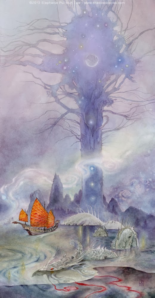
http://www.shadowscapes.com/image.php?lineid=23&bid=994
"Ships Passing in the Night"
Prints ($16.95 & $26.50) available -here-


A question I was asked recently:
How much do you use references for animals in particular?  

At this point, I mostly do birds from my imagination. Other animals I usually need at least a few reference pictures. I don't ever draw directly from any one photograph. Here's a pinterest board I use for gathering references on any one particular piece that I might be working on at a time: http://www.pinterest.com/puimun/references/

You can get a pretty good idea looking there, what my painting of the moment is. I like to gather a lot of angles and really start to form a picture in my mine about how something moves, because movement is always utmost important to me. I want my paintings to be active in some way, even when the subject is still, there is movement in all the interconnected elements.

Often photos are of static poses just because of the nature of what it is - a photographer waiting for a moment, and the difficulty of capturing spontaneous movement. For example, it's very hard to find any reference of a bird flying AT the camera because usually a bird will be seen in profile, or flying away from the photographer. You're also not going to be able to find lions pouncing out at the viewer either because...well...that might be the last photograph the photographer would ever take.

So I have to examine the anatomy and figure out how things would look from angles that are not seen. If you scroll down through that pinterest board, you can see that I've got a ton of stag photos currently, and going back a few weeks armadillos, owls, moths, chinese junks, monasteries, running children...etc.

Monday, January 20, 2014

Keeper of Keys

http://www.shadowscapes.com/image.php?lineid=23&bid=1019

Size: 7x10 inches
Medium: Watercolor, ink, metallic powders, gold leaf
Prints ($16.95) and Detail closeups available -here-


I was visiting the Berkeley Botanical Gardens the other day, right about at sunset. The sun was slipping down and through the dawn redwoods, setting golden fire to the edges. A bit of that image trickling through my mind, as well as the lovely bark textures of the redwoods, and a desire to revisit Muhru from my Dreamsign painting of last month.

http://www.shadowscapes.com/image.php?lineid=23&bid=1017

The sketch on the board. I didn't bother with sketching much of the background. I was going to let that happen organically. Just had a vague concept in mind for what I wanted, and the colors. The rest would happen as the paint dripped.

Here's the initial wash. This one takes the longest to dry. Because I use so much water, to let the pigment from the ink, metallics, and watercolor move, it usually takes about an hour before I can proceed.This is the scariest phase usually, though less so for this particular painting, because I spent so little time with the initial sketch. When I have a very intricate sketch it can be rather unnerving to pour all this ink onto the page and then hope things work out. I've started to lightly spray my sketches with workable fixative before proceeding so that the graphite doesn't get obliterated. I didn't used to fix my sketches.

Once that dried, I dabbed watercolor ground for the keys. I let the ground blob and mound up to create relief texture. Watercolor ground is basically a watercolor gesso-like substance. It's porous, and so you can paint watercolor on top of it.

And I lay a glaze of the watercolor ground over parts of the background as well to soften up the hardness of the black ink textures.

My daughter loved the keys. Every time she came to peek at what I was doing, she ran her fingers over the raised parts!

Once those base layers of texture are in place and dried, I start to pick out forms and shapes from the randomness with highlights and shadows.


Wasn't quite done with the background yet, but I decided to move on to Muhru and get him painted in so that I could figure out what colors he would be and therefore what other colors I needed to pull out of the background to tie things in cohesively.

Worked some more on the background, and then the final step was to apply gold leaf to the relief keys.
http://www.shadowscapes.com/image.php?lineid=23&bid=1017


Monday, January 13, 2014

Pittosporaceae


Pittosporaceae
Medium: Watercolor pencils & watercolors
Size: 9x12 inches

I was originally going to work on my companion piece to Nocturne today, and I did get a good start on finalizing the sketch, and then laying down the first wash. But the wash was taking a long time to dry, so I decided to scratch my botanical illustration itch. Been a while since the last piece. 

Snagged a few samples from my yard, since I really liked the woody seed pods of this plant.
 

After sketching, I very roughly colored with watercolor pencils, getting the basic colors blocked. Yellow veins, Greenish tones for most of the body of leaves, with some blue highlights.

Then I took a wet brush and painted all the areas, keeping the light/dark areas mostly separated to avoid too much blending.

After the water:

When that dried, I started going back in with watercolors to get more subtlety to the coloration. I like that the watercolor pencils add another layer of texture that feels organic and fitting to the subject matter, which is why I use it a lot for these types of works.

Tummy growled. 
Food break.
Yes, that is my fox plate staring at you with leftover Chinese dim-sum on it.

Break done, back to work. More layers of watercolors painted onto the lower dark glossy leaves.

I constantly refer to the sample when drawing. There's something about having a specimen in hand that you can turn around and examine from different angles, and really get in close to see the fine webwork texture of veins in the leaves. I've tried drawing botanical pieces from photos, but I always feel like I'm missing stuff that the camera didn't capture.

Went back and forth with watercolors and watercolor pencils, working in more depth of color.

Mixing a nice deep green....

Towards the end I add very select touches of highlights with a white gel pen.

And blend that in with a wet brush.

And for the very final step I use a fine lined neutral-toned gel pen. I like this moss green in particular, but I've also used browns and grays in other pieces. I like the sort of graphic quality it lends to do select outlining.


Thursday, July 11, 2013

Chasing a Dream

Size: 20x12 inches
Medium: Mixed
 Prints ($16.95 for 8.5x11 and $26.50 for 11x17), original painting ($1500.00), and detail closeups available -here-
Some of the sketches and photos of the process:
Starting off as scribbles in the sketchbook. I considered several different compositions initially as thumbnails.

Settled on this composition, although you can see this was not what the final piece ended up with. This was just the initial starting point, but after considering it for a while, it felt far too static, because the fish was on a horizontal plane above the ground, and it was all viewed from a very stable and flat perspective.
 So I decided to add a little more excitement to it. Tilted the ground to make it into a steep hillside that the children are tumbling down. It gives them more of a sense of movement and speed. (Both of these composite sketches were done by scanning all the initial sketches first and then taking the thumbnails and pasting the sketches of the children throughout, fiddling with size and angles and placement).
 I liked the second composition better, so I went forward with it, finalizing the sketch onto the illustration board for painting.
 Then the color rough to make a mockup of the final painting. I scanned the finalized sketch, then put it onto a separate layer in photoshop, set to multiply. Under that layer, I cut and paste some texture segments from other paintings and fiddle with the color settings on select areas to give myself an approximate simulation of what a final piece might look like. I really don't like doing color roughs, but I've found lately that they are immensely helpful in forcing me out of my "color comfort zones". I have certain color combinations that I use frequently, and that are easy to fall back on because I know that they work. Doing a color rough lets me try out combinations that I might not otherwise have thought to do.

 One of my favorite little parts is this little corner, where I was able to retain the india ink texture in the initial wash. If you've been following my blog, you'll know that lately I've been experimenting a lot with mixed media. Primarily utilizing india ink to create darker pieces, and textures. In most of those pieces I've been throwing the ink and paint onto pieces of illustration board, letting it dry, and only then trying to "see" the image inside the splatters (like seeing pictures in the clouds). It's a very freeing and fun exercise, and I've been enjoying both the process, and the results. Now I'm really wanting to try harness those techniques into more deliberate pieces, where I dictate the subject and composition, rather than pure randomness.


Saturday, June 30, 2012

Balance

Size: 18x22 inches
Medium: Watercolor & Pencil
Prints and original available -here-


Tried a slightly different process this time, on the recommendation of my friend Allen Williams. I did a much more detailed initial sketch than I usually do, in pencil, with some shading even. Scanned the sketch. Then Allen printed it out with his Epson (I've only got a puny laser b&w printer) onto my Strathmore board, at about 10% of the darkness of the original sketch. From there, I did my usual with watercolors and fixative layers. Though I did bits of shading with pencil here and there as well.

Sunday, July 25, 2010

Tam Lin - The Faery Host more progress

Another in-progress photo. Again, apologies for bad photo quality. Though this one at least I did during the day so there was better lighting.
Meredith asked me if I finished whole sections before moving on. Sort of. I finish tiny areas sometimes (like the little fairy figures, or the foxes), and other parts (like the background trees) I lay in base coats and go back to them as I develop those portions of the painting. I tend to jump around a lot to whatever section catches my fancy. In a painting this size I have a lot of room to jump around to!

Jumping around also helps to minimize waiting time if I have large areas that I'm waiting on to dry (i.e. the background). Instead of setting the painting aside and waiting, I can easily move onto another non-adjacent portion. Frequent technique question I get is, "How do you keep colors from all just blending together?" Easy, just don't paint next to a wet area unless you intend the colors to bleed. Although the skipping around is mostly random, I do generally move from the background up towards the foreground.

A couple reasons for that background->foreground order:

* To give distance, background elements are less crisp in detail. e.g. the spreading tree branches, wet on wet in some places to really let them fade out into the surrounding green.

* Easier to lay crisp edges of foreground elements on top of the background. Therefore I can kinda be messy about background stuff early on. Not too much since we are dealing with transparent watercolors, but some amount of leeway for messiness can be compensated for with lifting, or just by painting much more saturated foreground colors on top of.

* Speaking of saturation, since I was lazy and decided to skip doing color roughs, I really have very little idea about where I'm going with this piece for colors. I wanted green woods, so that part is a semi-gimme. And so it's been easier (brainless) to proceed with the each [choices] first. The more defined color choices have been put off so far. I'm still not sure whether I want that large foreground tree on the left to be reddish-brown, or purple-black. But by painting the colors that I'm certain of first I can narrow the possibilities for the uncertain areas gradually until the choice becomes much easier. A kind of organic process of elimination.

Closeups on some of the foxes I got to today!

Friday, June 11, 2010

Stuck on Spirals

I seem to be on a spiral kick lately (more so than usual even), both in the ink drawings I've been doing, as well as the paintings. This is another one that is stemming from what was originally a finished ink drawing. One of the really nice parts about doing all these inks lately over such a short period of time is that they're serving the purpose my sketchbook used to -- basically massive idea-dumping. I have a ready pool of concepts to pull from whenever a spare moment strikes. It's one of the benefits of daily sketching and keeping a sketchbook.

I've mentioned this before, but I'll reiterate: the best way to never have artist's block is to just always draw. When you're stumped, flip through the pages of sketches and something is bound to strike a spark of inspiration.

You may also notice that there have been many landscape oriented pieces (I mean the horizontal orientation, not subject matter). This is for a much more practical reason.... Little Claire loves to be carried around in a sling. It's extremely hard to reach to top of a portrait-oriented piece if it's sprawled across my desk 20 inches away + Claire!

And anyway it's a nice change from the years of tarot sized pieces! This particular piece is 10x20 inches again like the last one.

Monday, May 24, 2010

Transferring Sketches for Large Paintings

After some of my recent posts in the past months about how I digitally play around with rough sketches in order to finalize compositions, I've had some people asking how I then transfer the composite sketch onto the painting surface, especially for large images.
For this particular piece I'm actually using one of the ink drawings I did for the upcoming Minor Arcana book. I didn't have to do any digital tweaking of composition, however since I want to paint this at about 10x20 inches (and the original ink sketch is 5x10 inches), I resized it in Photoshop.
After resizing, I printed it out onto a couple sheets of paper (since it won't fit onto one sheet). Most of the time I flip the image horizontally first so that the final drawing will be oriented correctly, but I forgot to do it this time, and unless it's necessary for the image, like a musician being left handed if I forget to flip (I had flautists berate me once with a piece that I forgot to flip!), or needing to be oriented a specific way to fit the graphic design of a book/game/whatever, I don't generally worry about it too much. This is just a personal piece not meant for publication so I don't really care which way it faces.

I placed sheets of tracing paper over these printouts and sketched in pencil. Frequently my initial sketches are extremely rough. Not so much in this example since I started from a finished ink drawing. But with a rough sketch, this phase is very good for me to start refining the details. The translucence of the tracing paper allows me to see enough of the initial drawing, but also gives me some opacity to make changes - like details, or fixing anatomy, or giving character to faces.

For this piece, I focus on simplifying to get rid of all the extra ink lines of shading because I need this to be prepped for painting. So on the one hand I'm getting rid of some of the detail from the initial drawing, and on the other I'm adding things as well because this is now twice as large!

Once I finish, I take the tracing paper and tape the pages pencil side down onto the final 20x10 inch Strathmore lightweight illustration board (series 500).
Using my thumbnail I burnish across all the pencil lines. This transfers the graphite from the tracing paper onto the illustration board, like carbon paper.
And speaking of carbon paper, if this method sounds far too tedious for you, that is an option as well. You can buy graphite carbon paper at most art stores. After printing out your modified sketch, you would just place the carbon paper between your printouts and your final surface, and trace over all your lines. I like the method I'm describing to you here instead though because it gives me a chance to reevaluate my composition with each iteration.
After removing the taped tracing paper you can see the image has been transferred to the illustration board. Some places I didn't press hard enough with my pencil and so it's a bit light.
I go back in and darken and further refine the sketch directly on the illustration board. You can see the piece of paper I keep under my drawing hand as well to avoid smearing the drawing as I work.