Friday, September 25, 2009

On Computers, Productivity, and Unicorns

*grumble* Well, my new computer is delayed STILL. It was supposed to be shipped out on the 18th, but at this point it doesn't look like it will be shipped until the 28th at the earliest. Which leaves me very grumblesome.

On the bright side, without computer distractions I have been extremely productive. Can't scan any of the art yet, but I'm down to the last two zodiac paintings. There will be big pile of new stuff to upload once the new computer gets here. I might possibly be done with all of them by the time this mythical "new computer" ever shows up on my doorstep. So patience for your next fix of art -- this famine will definitely have a feast at the end of it.

Also, all pre-orders of The Art of Shadowscapes Tarot have now been shipped (up to 10 business days for US orders, up to 8 days for international, so if you ordered yours more towards the end of the pre-order period, it might be a couple of weeks before you see it yet), after a flurry of sketching all of the past two weeks, and marching many armloads of books up and down the two flights of steps from my front door to the street. Dana is convinced that I'm having him shuttle the same box up and down the steps each morning and evening as a thinly veiled ploy to exercise him.
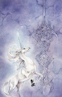
And finally, I heard from a little bird that The First Last Unicorn book by Peter S. Beagle might actually see the light of day, nearly 5 years after I did that painting (and the series of pencil drawings I did for the interior as well). I had thought that the publisher decided to scrap the project completely when a long period of silence ensued completion of the art, but they contacted me last week to let me know that it would possibly be released early next year. I might be adding a few more pencil drawings for the additional stories that had been appended to the collection in the intervening years.

* * *


Monday, September 14, 2009

71 boxes, 1500 pounds

*pant pant pant*

Well, 71 boxes of books now sitting in my garage. The Art of Shadowscapes Tarot has finally arrived here. Pre-orders: I'll be sending your books out over the next two weeks, in the order that the orders were placed, so please be patient. The books with sketches will probably take at least another week or two before going out.

I've got a lot of sketching ahead of me.

Wednesday, September 9, 2009

More Shadowscapes Previews

I got another preview from the Llewellyn designers today, this time for the companion book that will be packaged with the deck.


On another note, my computer's motherboard died the other day. So I'm without a machine of my own until the new one arrives in about two weeks. Oh noooooos, what will I do without a computer!?!?!

This means that art updates will be rather sparse until the new machine arrives, since I'm not inclined to lug my monstrous scanner over to my husband's office to set up.

The Art of Shadowscapes Tarot Major Arcana
books are scheduled to arrive this coming Monday, so maybe it's just as well I won't have a computer at hand to provide distractions. I'll be fairly busy doing all the sketches for the pre-orders and getting them all packaged and shipped in the next couple of weeks!

Saturday, September 5, 2009

Zodiac - Gemini

"Gemini"
Medium: Watercolor
Size: 10x14.5 inches
for Llewellyn's 2011 astrological calendar

The twins. The higher and lower mind joined by recognition of duality, social and enjoying the company of others, thought and communication.


To view the walk-through of this piece:

The Sketch
Part 1 (background)
Part 2 (painting skin)
Part 3 (main figures and foreground)
Finished Painting


Zodiac - Gemini in progress (part 3)

* * *

...continuing from previous posts...

The Sketch
Part 1 (background)
Part 2 (painting skin)


Shadows in the hair
With a small brush, I paint the shadows in the hair and wings with a mixture again of Elder Purple and Red Cabbage Blue. Not painting the actual strands, but the negative space around the strands.

* * *

Color to the hair

Adding some color to the hair now with a glaze of oranges and yellows. I try to vary the concentration of the glaze around the contours to add depth.

I leave highlighted bits of unpainted white.


* * *

The wings

Along the outer right edge of the wings, I use Stinging Nettle Yellow in thin glazes, being sure to leave thin veins of white showing through. Roughly this is sort of based on a dragonfly wing as a model, though with a different shape. Very thin, translucent, and iridescent wings. I vary the colors as I move towards their bodies, adding more blues and purples to the mixture, and periodically swiping the whole thing with a large brush of clear water. This serves to lightly blend and soften the edges (as long as it's done when all the colors are dry. If done too soon then it just blurs everything together and you lose all delineation).

Also, I finish up the gems in their hair, round spheres, basically using the same colors I've been using throughout. The darkest areas I dot with Payne's Grey.

* * *

The swarms

And finally the butterflies. I had a hard time figuring out what colors I wanted these to be. I waffled between golden oranges, bright crimsons, or deep blues.

In the end the oranges won out. A little variation from to distinguish from the rest of the scene, but not enough to distract from the semi-monochrome look I wanted the piece to have.

To paint these little guys, I started with a base of Stinging Nettle Yellow glaze.

Over that, I layer Gardenia Orange while leaving thin veins of the previous layer of yellow showing through.

Then with a mixture of Elder Purple and Red Cabbage Blue I blend in darker colored patterns, still maintaining the pale yellow veins. The neat thing about doing this is that at the blended edges, the blues start to layer with the yellows/oranges, creating some interesting interplay of layered tones.

And then finally the centers of the splotches are emphasized and made darker with a touch of Burnt Umber and Payne's Grey mixture.


Friday, September 4, 2009

Painting Skin

...continuing from previous posts...

The Sketch
Part 1 (background)

* * *

Painting skin can be tricky. Here's an example from my current painting, "Gemini." This basic technique can be used for a variety of other skin tones by experimenting with variations for the shadows, and the main glaze.

Most of the time I use combinations of cooler colors for the shadows. Greens, purples, blues. For the main glaze, I use yellows or browns, mixed with a touch of red and diluted.

In this example I'm using some non-standard pigments (Kremer) which were being used throughout the rest of the painting as well. The WinsorNewton colors (WN) are fairly standard and can be found in other brands as well.


Base layer of shadows
With a mixture of the Red Cabbage Blue and Elder Purple, diluted, I paint the shadows. I find it easier to do shadows first because when the main glaze is laid on top, the shadows get smoothed out nicely. If they are painted on top, you might run into problems of lifting and splotchy looking skin.

Main Glaze
When that has dried, I mix together the colors for my main glaze and swipe this on top. I make sure to leave some edges of white showing for highlights. Also it can be useful to leave bits of the shadow layer showing through as well. The cool shadows and the warm main tones side by side make for interesting contrasts that really bring out the depth.
For this particular image I did mix a bit of opaque white into my main glaze mixture. I don't often do this, but I wanted the chalkiness that this would add to the glaze. These two figures are almost like statues, and a semi-opaque glaze over the purple tones adds to this effect.

Over the warmer main glaze layer, I also did some light glazes of Stinging Nettle Yellow, which has a faint greenish hint to it. This provides a more bronze touch to their skin as well.

Emphasizing the Deepest Shadows
With a fine brush, I go back and emphasize the deepest shadows with a more concentrated mixture of the original shadows color, also mixing in a bit of Burnt Umber or Payne's Grey needed for the darkest areas.


Thursday, September 3, 2009

Zodiac - Gemini in progress

The Background

After the initial sketch, I start with the background of the piece. I start with a Lemon Yellow glow around the butterflies, and work my way outwards from there to lay in very light washes of mixtures of blues/purples.

In order to keep the yellow glows from just turning into sickly green tones, the purples are kind of used as a buffer zone between the two. Because I'm working in such thin and gradual glazes, you don't really notice the purple so much, and the transition from the yellow light to the blue skies is even and smooth.

* * *

Leafy Background

I work my way into the details of the background foliage now.

The general color scheme that I have in mind is for most of this to be an almost monochrome golden tone, with the blue of the sky offsetting that. I don't plan the colors too much, but I have some vague ideas in mind. Sometimes if a client insists, I'll do a very quick color study in photoshop; or if I run into indecision and can't choose between two options on a personal piece. Most of the time I just pick colors and run with it, letting each choice dictate what comes next in a sort of natural progression.

The more distant foliage becomes darker shadowy blue/purples - darker versions of the sky. As I approach the foreground, the leaves are more Lemon Yellow, Cadmium Yellow, and Naples Yellow. Filling in the shadows first, then lifting out bits of highlights. Leaving random watermark textures in some places without overworking them.

* * *

Walls and Arches

Continuing towards the foreground. Next up is the lower wall area. I can't finish the winding branches in those areas without painting the walls a bit first since, some of the branches twine around in front.

Again, most mixtures of yellows, with shadows of blues, violets and Payne's Grey. Mostly the same shades as what I had thus far been using for the foliage. On the upper walls laying in a base coat as well, but having yet worked the details up into that part yet.


* * *

More Walls

Throwing in some salt for texture along the walls. Keeping the areas around the wings of the twins brighter. More Lemon Yellow there, to have a nice glow, while the shadows fade to Raw Umbers and purples.

Haven't yet decided what color the butterflies will be, or for that matter, the wings on the twins. But starting to get some ideas at this point. Maybe a bright warmer yellow, or even orange for some contrast. Don't want to stray too much from the almost-monochrome look, but want a bit of sparkle and attention grabbing, since the butterflies really provide a lot of motion in this composition. Birds and winged things are great for that.

* * *

The Twins

Finally getting to the main foreground.

Pale, gold-ish skin. Underlayer of shadows with purples. Overlaying that with Naples Yellow, mixed with opaque white, and a touch of Alizarin Crimson. Not enough to make them rosy, but just enough to differentiate their skin tones a bit from the walls they are perched on.


Enough for one day. Finishing up (maybe?) tomorrow!

The Sketch
Part 2 (painting skin)
Part 3 (main figures and foreground)
Finished Painting


Wednesday, September 2, 2009

Zodiac - Leo

"Leo"
Medium: Watercolor
Size: 10x14.5 inches
for Llewellyn's 2011 astrological calendar


The lion. Loyal, proud, generous, outgoing and with a flair for drama, glories in leadership.

Now that I've gotten to the painting part of this project, things are much more relaxing!

So finally something not-green. Well, at least not predominantly green!

There used to be a time years ago when I didn't like orange and yellow. But after forcing myself to paint the full spectrum of colors when I chose the color themes for the tarot, the windows were thrown open.

One thing I like to do when looking at other artists' work, is to identify the characteristics in the paintings that I would normally steer away from in my own paintings, but that work really well in their cases. Sometimes it might be the strong use of a color I don't like, or an odd compositional element. Identifying those pieces, figuring out why I steer away from it in my work (fear of "ruining" a piece? never thought to utilize something that way? old preconceptions that have become habit?) and then figuring out how I can incorporate it into a future painting, is one way of pushing myself. No need to attack problems all at once though. Picking small elements and focusing on that one thing for a piece is a major step.