Part 2: Progression of a Painting
Continuing from where yesterday's post left off...
10x15 inches
Strathmore lightweight illustration board
Colors used in Part 3:
Winsor & Newton pan watercolors: Burnt Umber, Payne's Gray, Prussian Blue, Ultramarine Violet, Lemon Yellow, Alizarin Crimson
a few Kremer Pigments: Elderflower Purple, Stinging Nettle Yellow
Strathmore lightweight illustration board
Colors used in Part 3:
Winsor & Newton pan watercolors: Burnt Umber, Payne's Gray, Prussian Blue, Ultramarine Violet, Lemon Yellow, Alizarin Crimson
a few Kremer Pigments: Elderflower Purple, Stinging Nettle Yellow
Step 6 - Shadows
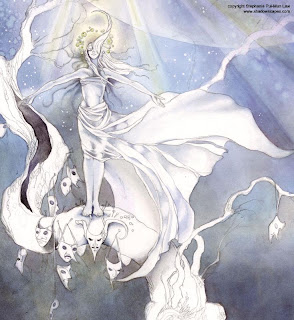
 I start to fill in the shadows along the tree trunk in the hollow, under the masks, and under her feet with Ultramarine Violet, Payne's Grey, and Burnt Umber mixtures. In the eye holes of the masks, I try to match the color or the sky behind them.
For the shadows on her body and clothing, I use Elderflower Purple. Keeping the shadows mostly to her core so that the edges can be limned by the moonlight and be more dramatic.
* * *
Step 7 - Skintones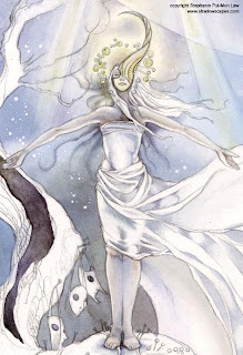
 I mix Alizarin Crimson and Lemon Yellow for a very diluted wash across her skin I keep this very pale. The colors need to be kept kind of muted to maintain a bleached-by-moonlight appearance. Too much color gives it a natural daylight look and would destroy the effect of the lighting.
I darken the flesh shadows with some more Elderflower Purple.
For her mask, I paint in the details with a size 0 round with Burnt Umber, and Stinging Nettle Yellow.
* * *
Step 8 - More Shadows
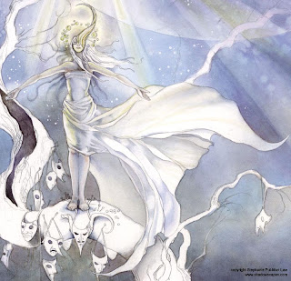
 The shadows on her body aren't looking quite dark enough, so I revisit that with a swipe of Elderflower Purple down the core of her body, and edge the shadows with some Stinging Nettle Yellow along the left and the to edges of her skirts. Also add some more shadows to her skirts with washes of Burnt Umber, Elderflower Purple, and Stinging Nettle Yellow.
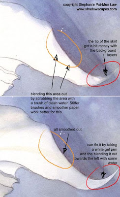 Cleaning up the White Skirts
When painting in the background, it's sometimes hard to keep from getting a little sloppy. But I prefer to fix this by lifting and blending than to preemptively do something about it like applying masking fluid. First of all, using that much masking fluid to cover up all foreground elements all time time would use up a lot of masking fluid. Secondly, masking fluid leaves hard edges that are harder to resolve than stray brush strokes.
When I first started with watercolors, I hadn't figured out yet how to do large swathes of background in even gradients, while maintaining clean foreground areas (see Step 1 of the previous post), and I did in fact use up a lot of masking fluid. But learning to paint around areas in the long run is much more effective.
At any rate, when I DO make "oops"'s and have stray bits of color wander where it's not wanted, it's easy enough to fix. If the forground element consists of a bright color, usually this will cover up the strokes. If the foreground element is a light tone (or white as it is here), I do one of two things:
1) Take a stiff bristled brush and wet it with clean water. Then I gently scrub parallel to the edge. This lifts the paint and softens the edge as well.
2) Pull out the trusty white gel pen (or white gouache works too) and dab in a bit to cover up what's not wanted.
* * *
Step 9 - Tree Trunk base layer
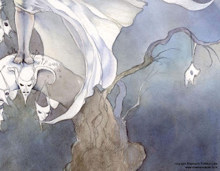
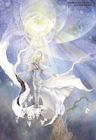 I'm still not quite sure what color to make her hair at this point, so rather than agonize over that, I'm switching to the background for a bit.
I use various mixtures of Burnt Umber, Payne's Gray, and Ultramarine Violet on the tree trunk. I tend to work in small patches at a time, so basically this and the next couple steps is repeated all the way up the tree trunk.
* * *
Step 10 - Bark Details
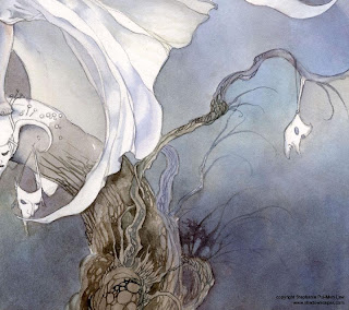
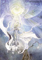 I mix Burnt Umber and Prussian Blue and with a size 0 round brush paint in a spiderwebwork of bark texture. Shadowy branches on the right were a bit of a mistake at first. I wanted some loose twigs, and tried to blur those with the background for distance effect, but the background colors proved to be too susceptible to lifting. I ended up dotting in more clumpy leaves there to cover up the botched lifting, using as little water as possible to prevent more unwanted lifting. (See? I do make mistakes, but "mistakes" are just complications you have to work with and turn to your advantage when it comes to watercolors.)
* * *
Step 11 - Highlight Textures
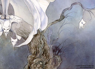
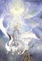 Lift highlights out from the bark texture by rubbing with clean water and a size 0 round. Neat thing about the layered colors is that when lifting now I sometimes get a more bluish tone in the highlights which is the Prussian Blue, because Prussian Blue is more resistant to lifting than Burnt Umber is.
* * *
Step 12 - Continuing Up the Trunk
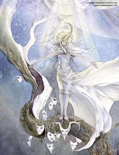
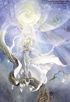 I start moving up the trunk, basically repeating steps 9-11. Lay in a base coat, texture, lift highlights.
STUNNING !!! thanks so much for sharing :D
ReplyDeleteYou're welcome!
ReplyDeleteJust awesome ^__^ !!! I have your book Dreamscapes, it is just great.
ReplyDeleteWow, gorgeous! How many hours of work is this so far, do you think?
ReplyDeleteOh my goodness Stephanie...you are such an inspiration!!
ReplyDeleteI will definately be needing a print of this one! lol
Probably a total of about 25 hours of work (for the completed painting)
ReplyDeleteThank you so much for sharing! I have problems with the background wash getting onto my main figures (but I don't want to use masking fluid) so thank you for sharing your tips. I'm going to try them on my next painting. :)
ReplyDeleteTwenty-five hours isn't too bad... the longest I've spent so far is about 30. Is this average for you per piece? I'm trying to figure out my own averages to see whether it would be better to work smaller, so this kind of information is fascinating to me. :)
ReplyDeleteIt really varies from piece to piece depending on the size. I spend anywhere from 1-5 days on a painting
ReplyDelete