

Medium: Watercolors, India ink, various mediums
Size: 25x20 inches
For detail closeups, prints, and original painting: -click here-
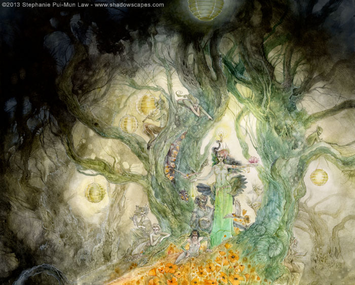
"The Lady drew herself up tall, and the lanterns dimmed by comparison to the unfiltered aura of her being. She was slender, with emerald eyes, and up close, Lily could see the fine veins that traced under her translucent skin like a fan of tattooed lace. Her hair was thick and black, and coiled in a serpentine cascade of braids. Jasmine blossoms were twisted into the strands, like sweetly perfumed stars. She wore a green silken shift with a subtle pattern woven into the threads, and belted at the waist with a tangle of jasmine vines. The patterns in the silk of her gown shifted and writhed like living runes, and her stark face was both terrifying and beautiful."
Started with this scribble of the faerie Queen Mab (lady of dreams) in my sketchbook. Looks faintly like Southeast Asian statuary. Regal. Distant. Slightly alien.

And her handmaidens.

Then a thumbnail to try and figure out how these initial elements might be placed on the page. Thumbnail sketch is only about 3 inches wide. Very quick. Mostly composition and placement of everything. I had some faint ideas of lanterns (the circles), and two twisted trees that Mab stands between.

Once I knew the rough composition, I had some other figures that I needed to develop in order to fit into that framework, and also determining more exactly the shape of the trees that Mab was standing between. So more scribbling in the sketchbook. A lute player lounging behind her, and more musicians in the tree branches, as well as fey spectators.

Now to combine things with Photoshop. Scanned all the sketches and moved things around in Photoshop so that they were all roughly in place.

More Photoshop combining.

And still more. Sometimes I mirror flip the sketch back and forth at this stage to spot balance issues in the composition. The reversed view gives a fresh vantage.

After I settled on the composition, printed it out and refined the sketch as I transferred it to the final drawing surface. This is one of the intermediate transfer sketches.

And the final transferred piece, ready to paint.

Painting.


I seem to be fascinated by poppies lately. Well, I guess I always am, but more so in recent pieces! But they have been fitting, as flowers of sleep, and these pieces have been about dreams.


Looking through these steps, it's kind of cool to see how many things we do the same way, even though we are using completely different media, especially in the early stages. I use little pieces of tracing paper, first, and then Photoshop, to put my compositions together--and when I get to the Photoshop stage, I also do the flipping-back-and-forth thing, to fine-tune the composition. (And then I look at the drawing in the mirror, every so often, while inking, to make sure light and shadow are not getting unevenly weighted.) Also, very nice painting! :-)
ReplyDeleteThanks socar! Yeah, I use the mirror too, and sometimes upside-down!
DeleteWonderful to see how you work your art, and interesting combination of light and dark...
ReplyDeleteStephanie,
ReplyDeleteAbout how long did this all take you? I love the way you utilize photoshop. what a time saver. I have photoshop but haven't really used it much. I need to get going and learn it. It is really a handy program. Thanks for showing this to us. Be Blessed.
Hard to really say how long it took since there was so much starting and stopping. but generally a piece this size takes me somewhere between 30-50 hours.
DeleteLove the details - as always. Do you use masking fluid to create those small whiter parts on trees?
ReplyDeleteNo, I don't really like using masking fluid. I don't like the hard edges it leaves. Most of that is just painting around the paper. Some of it is white gel pen.
Deleteever thought of becomming a concept artist for Cirque Du Sole?
ReplyDeletehadn't ever occurred to me! interesting thought.
DeleteHey there,
ReplyDeleteAgain a beautiful and wonderful piece, I just love the orange of the flowers. I was wondering what color you used for that? I have been searching for this color for a while, I would just love playing around with it! :)
(and yes, you would fit in the Cirque du Soleil team I think ^_^)
It's Cadmium Orange.
Delete