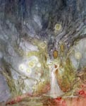
19x19 inches
Medium: Watercolor, ink, metallics powders, gold
Detail closeups and prints (8.5x11 inch @ $16.95 and 11x17 inch @ $26.75) -available here-
* * *
The process:
Initial brainstorming ideas. I scribbled some thumbnails. This one came together rather quickly. After the figure with the swirling mist in her wake I already knew the title, and had in mind the colors as well.
A more detailed sketch of the figure, using the first concept as a guide.
Then I scanned the thumbnail and figure and moved things around in photoshop. Flipping, resizing, determining the background composition.
Afterwards I transferred the sketch, much more fleshed out, onto the final drawing surface, and lightly sprayed it with workable fixative.
First drippy ink & watercolor washes. Doing this is giving me flashbacks to my Berkeley college art days where it was all about drippy paint and sloshing massive amounts of pigment onto huge canvases. Of course, this is only a fraction of that size, and I'm using the most sinful of mediums - the "illustrator's tool", WATERCOLOR!
A couple hours later, after it dried, a light fixative spray, and more washes, and then I started in on the distant background to the lower left corner.
Kept it light so that it wouldn't war with my foreground for attention later.
Slowly worked my way across the bottom and into a bit of the foreground elements.
And then up towards the figure.
I kind of worked in a counter-clockwise fashion on this piece, starting with the lower left background, then moving up the cascade of pools towards the figures and the trees in the upper quadrants.
Worked my way back along the glowing flowers that had sprung up in the wake, under her feet. Used white gel pen for these, and then blended with paint for shading.
A little bit of gold leaf for some accents.
Background trees.
Wasn't very happy with the shape of the arch, in the left side of it, and I had been putting off dealing with that area for a while. But at this point I had to address it. Finally reshaped the area with some watercolor ground and ink and created a much more pleasing (to me) silhouette.
The owl.
Finishing up the lower foreground areas and incorporating it better with the rest of the piece.


_.jpg)
_.jpg)
_.jpg)
_.jpg)
_.jpg)
_.jpg)
_.jpg)
_.jpg)


_.JPG)
_.jpg)
_.jpg)
_.jpg)
_.jpg)
_.jpg)
_.jpg)
_.jpg)
_.jpg)
_.jpg)
_.jpg)