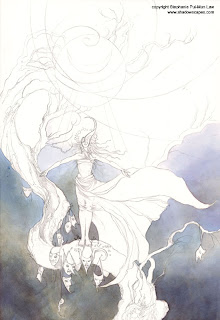
(Part 1 with the initial sketches and concepts
here.)
* * *
Note: This isn't meant to be a tutorial so much as a walk-through of my process. When writing instructional tutorials I try to be a bit more purposeful and conscious of choices made. Though in truth my process is usually much more chaotic and consists of decisions made on the fly.
Chaos doesn't generally make for very good instruction though, so while I try to define a process in Dreamscapes that is logical and easy to follow, I think simultaneously that "simplification" raises an illusion about creating art that makes things more daunting in a way.
I wanted to show here that it is not always so thought out. Every choice about color and composition doesn't have to be made before you start (though with watercolors, you do have to have at least a general idea in mind). And that accidents and decisions made on the fly are a part of the whole process. A part of the fun of creating art in fact. * * *
 Step 1Laying in the Background
I start off with the lower background, working from the ground up.
Courtesy of my friend
Sophie Klesen, I have in my posession some lovely paints from
Kremer Pigments Inc. Their colors are historical pigments, and have a fascinating way of separating and creating unexpected variations of tone, especially when some kind of texturing is applied to the wet paint.
At any rate, I've fallen in love with this
Elderflower Purple. I've been looking for an excuse to use a lot of it.
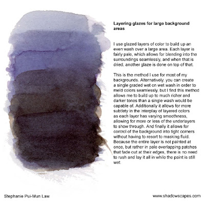
I painted the the lower area in with many thin glazes, alternating the purple with some mixes of Burnt Umber and Payne's Grey as well. At one point I realized that the purple lifted exceedingly easy. And I know that Burnt Umber and Payne's Grey are generally more permanent. So as I started on the left lower corner, I painted the lower layers with the greys and browns and reserved the upper layers for the Elderflower Purple, and I found this made creating a smooth background much easier.
Determining the ordering of layering is something that you figure out as you experiment and actually work with colors, as every pigment has its own qualities and lifts easier or harder or behaves differently when splattered with salt or rubbing alcohol.
 Step 2Background Skies
Moving upwards, continuing the slow layered glazes up into the sky. Now though I'm splattering it as I go with rubbing alcohol to create a starry texture.
I'm using a no 10 round brush for most of this, blending out small patches as I go so that it creates a seamless background. You can notice there's color shifts in the upper sky of what seems like blue and purple varations. Here's one of the things I love about these Kremer pigments -- that's all from the one Elderflower Purple color. It just...varies by itself.

And if you look closely at the rubbing alcohol splatters, it looks more like Cerulean Blue in the center, with Magenta outlines. Pretty neat stuff. :) Can't wait for Sophie to send me more colors from Germany at the end of May.
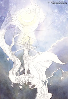
Anyway, lots of splattering and glazing, and a Lemon Yellow nimbus around the moon, and her head, blending into the white surrounds with water and dabbing with paper towels.
 Step 3Moonbeams
I keep darkening the background with more glazes. This kinda just keeps going until it
feels done. Watercolors dry pretty fast, though not instantly. So sometimes after working in a wash say in the upper corner, I'll want to continue layering there but it's currently wet. So I'll switch to another layer at the lower corners instead and then switch back to the top after it has had a chance to dry. I jump all over a painting like this, working wherever is currently convenient. There's no need to stay locked to one element of the piece at a time.
Now for some more Kremer fun, I pull out the Stinging Nettle yellow, which sometimes surprises me with little bits of crimson in unexpected places. But I use that to fill in the moonbeams, blending it softly into surroundings. Leaving the moon itself with the white of the paper.
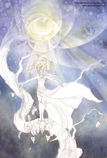 Step 4Need More Moonbeams
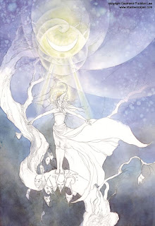
!
At this point, I sat back and decided that I didn't like the symmetrical moonbeams just on her outstretched hands. The background was looking too BoringBlue. Considered for a while, then decided to add more moonbeams off to the right side. Sketched in very faint guidelines in pencil, then proceeded to paint those in with more Elderflower Purple and Stinging Nettle.
 Step 5Stars and Shadows
Trusty white gel pen, dotted in the stars. I'm not really a stickler for purist watercoloring. If it works, do it.
Also, shadowy tendrils of hair on her with various mixtures of Payne's Grey, Burnt Umber, and Elderflower Purple.
So here's my stopping point for today. Some book layouts are calling to me so for the moment Moonbathing has to be set on the back burner. More will be forthcoming over the next few days!


